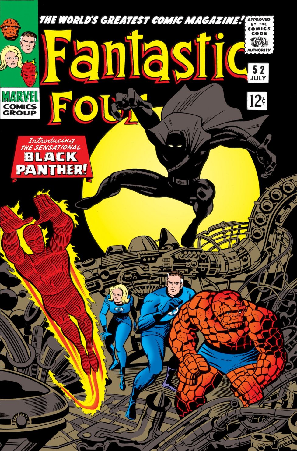
It is worth noting that my ideas for this linear photo art montage technique used for Nightlife were hugely influenced by the new use of double-page photomontages by Jack Kirby of Marvel Comics, and the later, more elaborate montages, by my friend Jim Steranko, the greatest comic art innovator of his time.


These panels may look a little primitive to anyone reared on slick Photoshop montage but this was way back in the late 60s and early 70s.
For anyone who was a fanatical comic collector like myself these were truly innovative creators and while they look a little primitive today back then they were ultra-cool and very new, pushing the boundaries of traditional comic book art.
For anyone who knows about Marvel Comics back then in the early 70s, they were more creative, innovative and ground-breaking in their writing, storytelling and artwork than the biggest comic book company at that time, DC Comics.
Both myself and Philip loved Marvel comics and Philip was aware of my vast collection so when he stayed in my place he was buried in Marvel comics, often spreading them over the floor of the front room as we discussed ideas of all kinds. And we would agree on who was the best artist and who was the best writer and of course which was the best comic.
The genius that was Jack Kirby was our common bond hero but Philip and I just loved Kirby’s new creation, ‘The Black Panther’ who first appeared in the Fantastic Four comic.


Now back then there was the famous and very radical Black Panther Party so this was one courageous move for a still rather small comic book company and the much later and hugely lucrative Marvel Movie Age was a far-off fantasy, littered with poor animation films and second class movies.
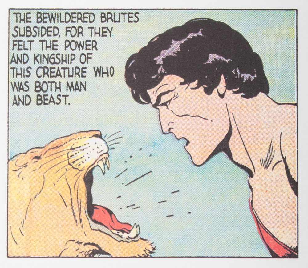
If you look at my own drawing of the panther the debt to the Kirby creation is quite clear. The image is a mixture of Kirby’s more abstract compositional skills and the extraordinary jungle cats of another comics great, Bourne Hogarth and his epic ‘Tarzan’ comic strips.


Like any young artist I was in awe of these art superheroes myself and I was lucky enough to meet every one of them via the San Diego ComicCon where I was a guest a few times in the early 80s. (Where I was awarded the coveted Inkpot Award.)
It was Jim Steranko, who recommended me to the ComicCon committee as a guest and thus came my invite.
I had met Jim Steranko at a UK Convention and became friends with as we had a lot in common as artists despite our different mediums.
My first breakfast in San Diego, after a very long and exhausting flight form Ireland, saw me joining Bourne Hogarth, Ray Bradbury, Jack Kirby and a few other amazing guests of ComicCon at the guest table.


Later when I was formally introduced to Jack and Roz Kirby the great man said to Roz: ‘This is the young man we have heard so much about’ and invited me to dinner.
I reached into my pocket for my own biz card and he wrote it on the back.
Still have it too. Money can’t buy that card.
