This is a brief cataloging of the Thin Lizzy logo and how it developed over time.
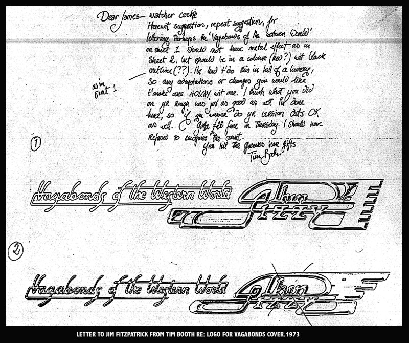
Below is the note from fellow artist Tim Booth with the original Thin Lizzy logo design which I adapted and strengthened.
The logo as used on the album cover, the ads, and the poster for ‘Vagabonds of the Western World’.


I redesigned the Tim Booth logo for use on the poster for ‘The Rocker’. I presumed, with a little tweaking we would use this version on all future albums.

Philip loved the poster and the new adaption of the Tim Booth logo but was grabbed by the lettering I designed for ‘The Rocker’ poster and asked me to see if I could use this letterstyle for a new Thin Lizzy logo.
I spent time on this one and the end result was this little piece of artwork. I must have had amazing eyesight back then.
The new logo was first used on the back cover of ‘Nightlife’.


The logo was then first used on an album cover for ‘Fighting’.

The next important usage of the logo was on the huge mirror backdrop. There were two or three of these made and they looked amazing at the time.


The logo has proliferated and evolved over the years but they all remain true to the basic letterstyle design.
The final version of the Thin Lizzy logo is this elaborate airbrush artwork, created in 1981 for a projected album titled ‘Trouble Boys’ but never used and never paid for either by the record company.

The Black Panther/Thin Lizzy logo was actually an afterthought and was never used until it appeared on the cover of a French Lizzy tribute album in 2001.

Boxed set cover 2021.

Rock Candy magazine feature story of the creation of the Lizzy logo
