This one of my favourite album covers for legendary Irish rock band Thin Lizzy and for my friend, the charismatic front man, Philip Lynott.
This album is a compilation of tracks from the years 1971-1974 when the band was signed to Decca Records, one of the best and most successful British record labels of the last century before upstarts like Vertigo and Virgin Records showed them the future. The album was released in 1979.
Decca back then was run by a northern Irish A&R man, Frank Rodgers. Frank was a lovely man to deal with and I always enjoyed working with him, always courteous and good-humoured, generous too.
That’s my way of saying I got paid ☺ -and it was a decent amount for a compilation album.
I had worked with Decca, Frank and Philip on my first artistic assignment for Lizzy with the cover design and poster for the wonderful and original ‘Vagabonds of the Western World’ and later on the first Lizzy compilation album ‘Remembering Part 2’ so all three of us were well used to working together.
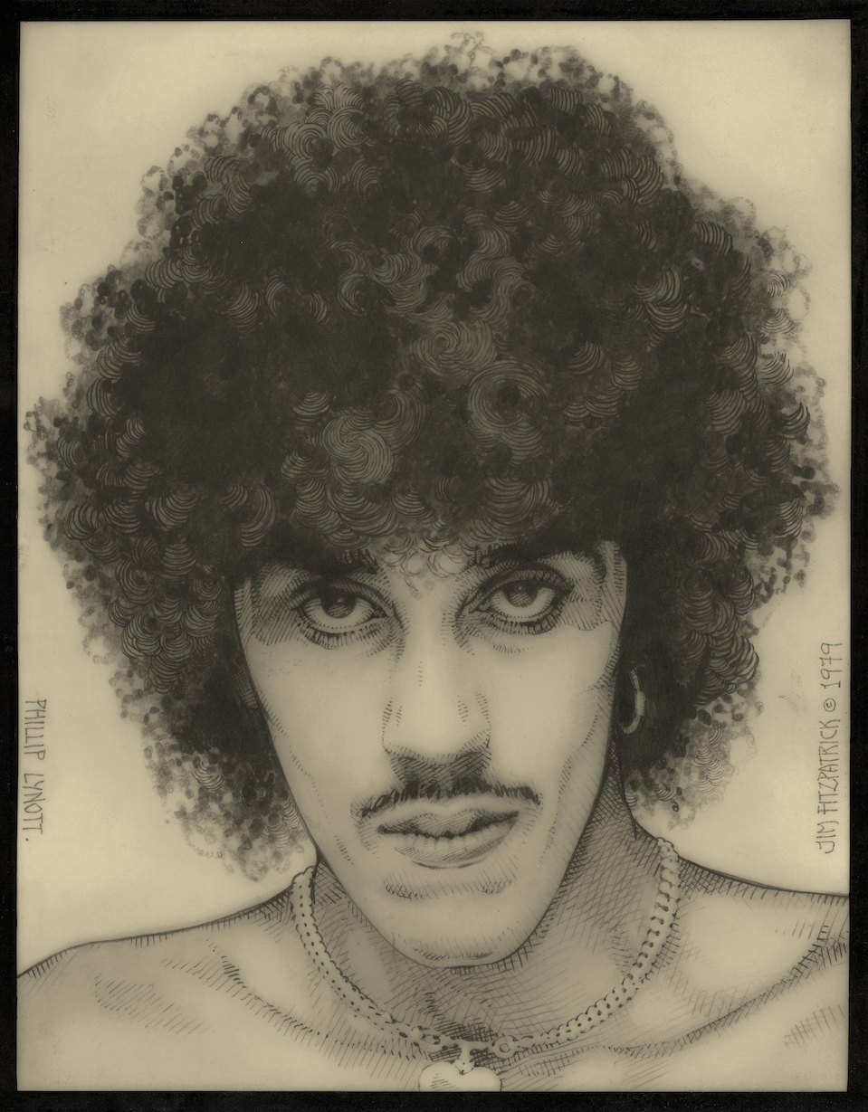
Philip loved a portrait of himself I drew in pencil for his first book of collected lyrics, ‘Songs for While I’m Away’ in 1979 and wanted this image as part of the cover for ‘Saga’ so that made my life so much easier.
Normally we worked so well together that Philip completely trusted me and could also read my roughest sketches and allow me, and trust me, the freedom to bring them to fruition in my own way without interference.
In this case it was a straightforward artistic challenge. Philip wanted a portrait in colour on the cover so I went to town on it.
I drew the cover in pencil again, photographed it onto clear litho film and then, using endless masks, I airbrushed the image using a broad nozzle spray to give a stippled texture and followed this with a painted starry spacescape for effect.
We were back to the old Vagabonds ‘Cosmic Cowboys’ imagery that Philip loved so much. (I think publicist Tony Brainsby came up with that one for the Vagabonds press release but I could be wrong. It did get us a lot of press and radio coverage in the UK for Lizzy and the album).
It took me a few tries to get this cover art right until finally I had it finished and was happy with it so I had the earlier Decca albums photographed at an angle and reduced in scale by my professional photographer friend Louis Pieterse, who I used to record all my artwork.
Today, with Photoshop and my trusty Mac, I could do all this stuff myself from start to finish onscreen in a fraction of the time but back then it was all hand done, the hard way with the photos cut out by scalpel to a fine thinness so the edges would not show, then gummed and stuck to the actual painted, airbrushed artwork.
The only thing myself couldn’t agree on was the spelling of ‘Ageing’ since it is also correct to spell it as ‘Aging’ so we called an expert in English I knew and ‘Ageing’ it was. I hated the other spelling anyway.
There’s a postscript to this new print image:
Over the years I have given almost all my Lizzy albums and stuff to friends and fans so when I decided this was due to be made into a print I had a slight problem. I had no copy of the cover so I had to go on ebay and buy a copy.
The print you see here is actually a composite of the printed album cover scanned, with the actual real airbrushed artwork overlaid via photoshop onto the printed cover so the sharpness of the original is fully retained and it is all restored to it’s former glory.
Great to see it finally restored to its former glory and ready as a new print on my website at last.
Semper Fi. Always a Lizzy fan.
THIN LIZZY. SAGA IMAGES. V1. 23 August 2019.

00. My original pencil drawing of Philip from 1979. It was Philip’s idea that we use it as the basis for a new cover for a Decca Records compilation album of Thin Lizzy music made while they were signed to that very iconic label.

01. This is a paper negative of my original drawing. The methodology of creation was so labourious and time consuming.
It is hard to believe today just how much work was put into these artworks long before Photoshop made all this so easy now.
Back then it was all handmade art and this was where I started, with the huge ‘Grant’ reprographic, lithographic camera in my attic -with three trays of smelly chemicals. First diluted liquid developer, then fixative which smelled of ammonia to fix the image from any fading, finally another dish of water to wash all the chemicals off.
The print was then stuck to the bathroom tiles to dry flat and not buckle. Finally it was mounted on board and new positive prints made from that same paper negative.
I hate to say it but that was just the beginning of the process.
All the images you see here are actually litho prints I made onto clear cell film and they took even longer and more care demanded for a clean result.
It took hours of darkroom work to even get to this point.
(Photo of Grant).

02. This is one of those litho cell prints used to experiment with airbrushing colours for Philip’s darker skin tones. I wanted accuracy so it took time.

03. Close-up of the rough airbrush work.

04. A closer look at the texture building up, layer by layer, mask by mask. Each mask took about an hour and often the scalpel, no matter how carefully used, left tiny cut marks which I hated of they showed up too much on the reproductions of the image.
The real art of scalpel mask-cutting was something I learned in London around 1972-73 when I was working with Alan Aldridge Associates studios and airbrush experts Bob Smithers and Harry Willock. I knew how to do it from my days in advertising but my skills needed burnishing and improving badly.
I remember Bob airbrushing Green Giant advertising art -thousands of green peas, each masked with transparent film one by one and coloured with every on having a light reflection point on the visually ‘curved’ surface.
Now, today, a Photoshop Clone Tool will do a lot of that work but back then, it was all done by hand.
One thousand peas later it was ready for printing after the finished artwork was photographed by the platemaker. Mad stuff. But big money too!

05. Some of the cell tryouts from the original negative shown beside them.
06. 07. 08. Leftover cell prints and other bits and pieces.


09. That same, more finished tryout with the lettering , all Letraset and hand applied.

Those were the days… don’t miss ‘em one bit. Thank heavens for technology, unfortunately it is still VERY difficult to get that old-fashioned hand drawn, handmade look, even with all the great filters and effects available.

The end result is one of my best ever portraits and even today, I hope, it stands the test of time.
I was blessed to work for such a charismatic man like Phillip Lynott and his wonderful band mates in Thin Lizzy.
Le little did we know back then I would be still talking about it and explaining how the process worked. At the heart of the process was the trust Phillip gave me.
Even in this one all he had to go on was the one conversation with me and then he just let me get on with it, and I must thank the two managers, Chris O’Donnell and Chris Morrison, both lovely people who backed my work and tried to get decent fees for me -and did right up to the end when it all started to unravel.
Another story for another day.
Check out the print of Philip Lynott Saga of the Ageing…. here!