The Final Cover and Poster Art
The cover for Nightlife was a slightly odd one but very important too. This was Lizzy’s first album on the Vertigo label and it was vitally important I got it right.
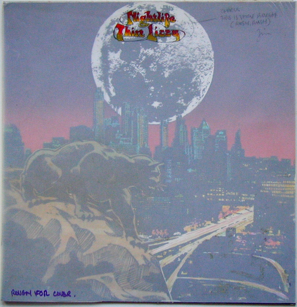
I was very influenced by Roger Dean at the time (I still love his artwork) and it shows in the lettering, the rest is a photo montage influenced by the collages of comic book artists like Jim Steranko and Jack Kirby which were appearing in Marvel comics -and myself and Philip were huge fans.
At that time, with the success of the cover art for Vagabonds and the fact that the UK music press and UK media took such an interest in the artwork was both inspiring and intimidating.
Looking back now I can see this was indeed the Golden Age of album cover design and artwork and in my own head I was now competing with the very best, not just in the UK but in the US as well where there were so many fine artists producing great art since the early days of Fillmore West and the innovative work of artists like Rick Griffin, Mouse, Kelly, who later became my friends and of course Crumb, Victor Moscoso and Wes Wilson.


In the UK Roger Dean, who later became my publisher for ‘The Book of Conquests’ via his new publishing company, Paper Tiger Books, was showing his brilliance with his covers for prog rock band Yes and many other great bands of the time.


This was my motivation; to try to be at least as good to emulate as these artists and maybe even excel myself so the chips were down. Thus had to be damn good as far as I was concerned.
I have already, in the previous blogs, explained the way I went about constructing the artwork but it is worthwhile to look at the very first design I did for my friend and collaborator Philip Lynott and as you can see, the first rough and the content became the template for the more carefully finished artwork.


Strangely enough, looking back at the final rough and the finished art for the cover I actually prefer my original colour balance in the rough. On the final artwork, I muted the blues in the cityscape to allow the black panther to stand out more but the sky colour is also much better in the rough. The wonders of hindsight.
The Thin Lizzy Logo.
While I used the Roger Dean influenced lettering on the cover, which was ready well ahead of the deadline, I was asked by Philip to do a poster for the release of ‘The Rocker’ for Decca records -who had dropped the band earlier -which was a slight conflict of interest for both of us but that’s the music business.
Since ‘The Rocker’ was my won fav Lizzy song anyway this was a blast and since Philip and the Decca record company gave me a free hand as usual, myself and Philip went back to our comics roots again this time echoing the new British comic character from the UK 2000AD comic book, Judge Dredd -and his oversize motorbikes -for our image.