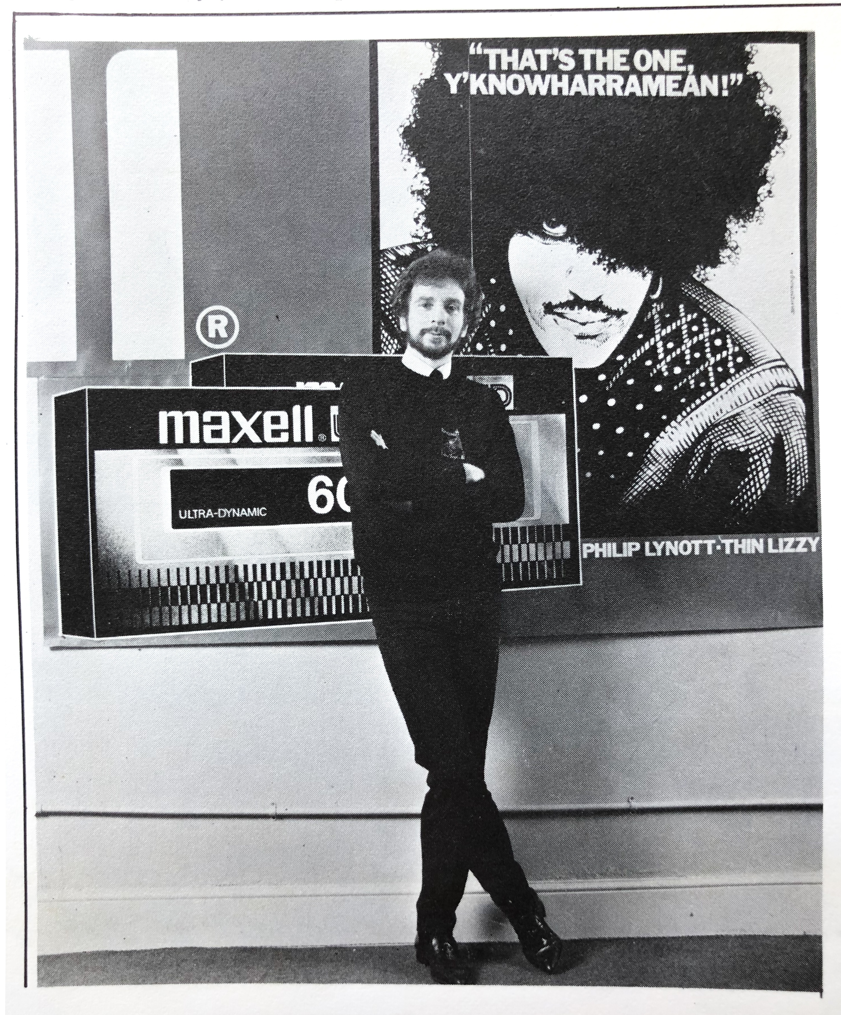
‘Maxell are the best, youknowharramean.’

This one was for Philip himself and we did it for a commissioned series of bus sides, posters, even 48 sheet billboards, for Maxell Tapes, a major Japanese company back then. The first version was in black and white and used as a promotional poster for Maxell, the colour version was for what was, and still is, called a ‘Bus Side’ (yep it’s a long print on the side of a bus) and had a copy line I wrote myself which read, in really large type, with this portrait artwork of Philip included:
‘Maxell are the best, youknowharramean.’
I thought this phrase nailed Philip’s way of talking. I fell about laughing when I first saw it on a bus passing Grafton Street, where myself and Philip the Spiderman had first met.
It was a commercial piece produced with Philip’s full permission and co-operation but the copy line was not discussed properly as Philip was unavailable for whatever reason.
He was a bit pissed at me for this colloquial liberty at first but so many people came up to him or shouted over at him ‘Youknowwharramean!’ that he quickly grew to enjoy and even love it, laying the phrase on thick whenever he got a chance.
He used that phrase always in any conversation and after the ad tag became a catchphrase he used to lay it on thick himself when he had a chance and make fun of himself by going ‘Youknowwharramean’ after every sentence when we were hanging out with Frank Murray in the Bailey or Nearys Pub., our usual haunts when Philip was back home.
Dublin loved Philip and Philip loved Dublin

Once when I was with him he went running the length of a bus on Grafton street with the startled passengers looking out at him as he legged the side of the bus with this huge red, black and blue image of the himself on it as it slowed down at the bottom of Grafton Street in Dublin.
I was cracking up and he was too. Dublin loved Philip and Philip loved Dublin; it was a two-way love affair with this extraordinary black Irishman.

The Maxell ad campaign was my gig (I was a freelancer but was contracted to Davitt and Partners advertising agency back then) and I negotiated one large check for Philip for usage of Philip’s image and catchphrase so everything ended in a laugh as he reminded me I was the only one who would have had the nerve to pull it off (putting that line in without telling him).
Philip obviously gave me loads of work so it was cool that I got this gig for him at a time when he was actually very stuck for money.
At that time he had enormous financial problems and the money I got him for this gig helped get him through it all but only just. The real problems were piling up fast all around him and he was floundering badly and needed help, both medical and financial.
Anyway back to the story of the image:
The poster was derived from my portrait on ‘Black Rose’ and was also used later for a Thin Lizzy Japan tour poster.
For me, this is the man himself; no one like him. I always laugh when I see it reproduced. Bet he does too.
Ní fhacamuid a leithéad arís. –JF
The Story of the Artwork. Technical stuff mostly 🙂
For most Thin Lizzy works, covers etc, I drew the originals in pen and ink line and then photographed them on a glass plate mounted onto a massive photo repro machine called a ‘Grant’ -all negs and prints were produced the old way with wet developers and fixers. Smelly work too as the developer ammonia lingered everywhere and discoloured my fingers and left them stinking of garbage and pee. I still have that amazing old-tech machine up in my attic and use today very occasionally despite my hi-tech studio.

The photographic paper negative result was then transferred to clear litho film via contact through the lights atop the Grant and the result was a line drawing on clear film, pretty much like cartoon animation cell art. It was beautiful to paint on, as the original line art held it’s form and the painting was done directly onto this film which gave a beautifully clear heightened sense of colour in the final reproduction. My cover and back cover for Thin Lizzy’s ‘Black Rose’ shows a more simple version of this complex technique. More subtle effects were difficult to obtain unless I used the airbrush and masked whole intricate areas endlessly until I got the result I wanted; it was exhausting but satisfying, and very satisfying when I saw the printed results.
My work method when I was under pressure was always to have two versions on the go at the same time so even if it went missing in transit over to London I had a very certain fallback position and all was not lost. That is the first reason as to why I had more than one version of artwork in progress at the same time. The second reason was to have another version ready if I messed up the first one, as deadlines were always looming for Lizzy and advertising work and had to be kept to no matter what went wrong. I was meticulous then about deadlines and I’m the same today for commissions.
Often the first rough version, with quick retouching, was actually used for the final artwork -as with the chessboard painting and pastel art for ’Fatalistic Attitudes’ and the Philip Lynott/Maxell artwork discussed here.
It should also be noted that this portrait of Philip was based on the band portrait on the back cover of ‘Black Rose’.
The reason for this was simple: Philip loved that one and had previously asked me to do a larger, single portrait for himself derived from that work. I still have a very unfinished painting of that myself somewhere in the attic I think. It was never finished as certain events overtook the creation of the artwork. And I ain’t telling 🙂
Ynowwharramean?
The Maxell Philip Lynott artwork. 1982 (completed 2011).
The first of the two versions of this portrait of Phillip Lynott is a smaller version then the intended final artwork and is the one used in most of the campaign and was intended as a rough presentation waiting to sell the artwork to the client, a Japanese Manager for Maxell worldwide, who came over for this campaign launch in Ireland. Tape recording was a vast industry back then.
He loved it and told us to proceed immediately rather than wait for the more finished version and that’s what happened. Not only that but the artwork disappeared with him once the agency had it photographed for reproduction. I presume it is on a wall now somewhere in Japan.

The more complete -and to my mind superior -version of this artwork was painted on a large 30”x40” canvas with the blacks painted with gloss emulsion and the colours added in acrylic paint, with additional pastel and white pencil work for highlights. The painting was completed only in black and abandoned until in 2011 when I decided to actually finish it off, just as I intend to do with the larger unfinished version of ‘Fatalistic Attitudes’ which I am working on right now as I write this commentary.
The finished painting was on a much larger canvas, which I intended trimming but when it was finished it seemed a real shame to cut it up so I just added a grey border with pattern around the edges and that complimented the portrait and added to it.
Maxell Poster. 1981/1982
Luckily I’m a hoarder when it comes to my art and the interesting printed ephemera that springs from it.

This cool vintage poster is a nice example. A roll of over a dozen mint posters were found, along with a load of other vintage posters only a few months ago when I was clearing out my house for sale.
The poster is a lithograph in one colour, black, on plain white cartridge paper and was produced for the bestselling Japanese brand Maxell who made…yep… audio and videotape. Who could have imagined that such marvelous technology would be redundant in virtually the blink of an eye, replaced by digital and computer art technology.